Expresses a strength of the correlation between a categorical variable and a objective variable with the correlation ratio
statisticspythonPearson’s Product-Moment Correlation coefficient, calculated from the covariance \(\mathrm{Cov}(x,y) = E[(x - \bar{x})(y - \bar{y})]\) and the standard deviation \(\sigma_x = \sqrt{E[(x-\bar{x})^2]}\), is usually used for expressing the correlation.
$$ \rho_{xy} = \frac{\mathrm{Cov}(x,y)}{\sigma_x \sigma_y} $$
However, since this coefficient expresses linear correlation between quantitative variables, it cannot be used for categorical variables, which are qualitative variables. The correlation between a qualitative and a quantitative variable can be expressed as the correlation ratio, which is the ratio of the interclass variation (= total variation - intraclass variation) to the total variation \(\Sigma(x-\bar{x})^2\) . It takes values from 0 to 1, and the closer to 1, the stronger the correlation. For example, if the mean values of all categories are equal, the value becomes 0, meaning there is no correlation.
import numpy as np

def correlationRatio(categories, values):
    interclass_variation  = sum([
        (len(values[categories == i]) * ((values[categories == i].mean() - values.mean()) ** 2)).sum() for i in np.unique(categories)
    ])
    total_variation = sum((values - values.mean()) ** 2)
    return interclass_variation / total_variation
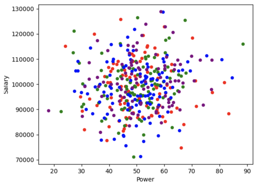
Actually, the correlation ratio for random data is a small value of 0.012.
import pandas as pd
import numpy as np
import matplotlib.pyplot as plt

np.random.seed(100)

N=400
df = pd.DataFrame({
    'Team' : np.random.choice(['A', 'B', 'C', 'D'], size=N),
    'Power' : [np.random.normal(loc=50, scale=10) for i in range(N)],
    'Salary' : [np.random.normal(loc=100000, scale=10000) for i in range(N)],
})

_, ax = plt.subplots()
df[df['Team'] == 'A'].plot.scatter(x='Power', y='Salary', color='red', ax=ax)
df[df['Team'] == 'B'].plot.scatter(x='Power', y='Salary', color='green', ax=ax)
df[df['Team'] == 'C'].plot.scatter(x='Power', y='Salary', color='blue', ax=ax)
df[df['Team'] == 'D'].plot.scatter(x='Power', y='Salary', color='purple', ax=ax)
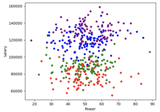
If the average is different depending on the category, it becomes 0.811, indicating that there is a strong correlation.
salaryAveragePerTeam = {
    'A': 80000, 'B': 90000, 'C': 120000, 'D': 130000
}

df['Salary'] = [
    np.random.normal(
        loc=salaryAveragePerTeam[df['Team'][i]],
        scale=10000
    ) for i in range(N)
]


